Originally published on the InterWorks blog.
Does your organization use data to better inform its marketing? Have you heard the words “segmentation” or “micro-targeting” thrown around and don’t quite understand what it means? In the spirit of the World Series, this article provides an example of customer segmentation using baseball.
The goals are twofold:
- Use data from 2013 to develop statistical groupings of Major League Baseball pitchers, both starters and relievers, and generalize about what types of pitchers make up those groups.
- Use those groupings to develop a predictive model that predicts what grouping a new observation would fall into.
How This Relates to Business
Each player can be thought of as a customer of a fictional company. Each customer has data points because they’ve been customers for at least a measurable length of time. Once customers are placed into similar groups, those groups represent “types” of customers. In the future, custom-fit marketing campaigns can appeal to each group, thus increasing the success of marketing efforts.
Statistical Groups
Customer or market segmentation tries to find groupings of observations in data using similarity or distance measures. Two very popular methods of clustering are hierarchical and non-hierarchical clustering.
Hierarchical clustering looks at a distance matrix and groups observations into a “hierarchy” of groupings. This can be done in two ways:
- Agglomeratively: Start with individuals and group the closest observations together repeatedly until there is only one group.
- Divisively: Start with one massive cluster and split groups repeatedly until you only have individuals.
Non-hierarchical clustering uses algorithms to group standardized data after specifying the desired number of clusters. K-means is a popular version of non-hierarchical clustering.
For this example, hierarchical clustering was used because one problem with algorithms like k-means is that “they don’t handle categorical data very well.” Using the nnets package in R, the Daisy function creates a distance matrix using Gower’s method that handles categorical data and standardizes it.
Preparing Data
Clustering is influenced by large values regardless of scale. For example, HR (home runs) would have more influence than opponent’s batting average because HRs reach double digits while batting averages stay between 0 and 1.
The Daisy function standardizes data automatically, though many R packages offer standardization options.

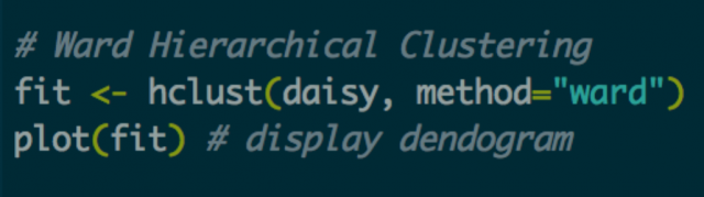
Creating the Distance Matrix and Running the Algorithm
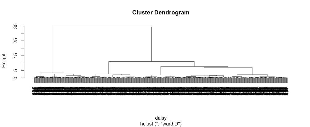
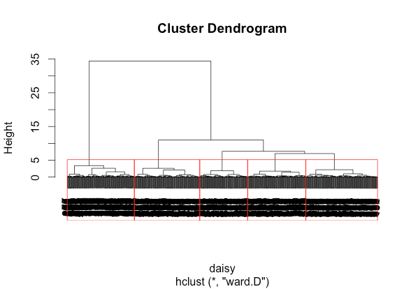
After cleaning and standardizing data, hierarchical clustering runs using Ward’s method — one of the most popular ways to calculate distance between clusters. A dendrogram is then plotted to visualize the results.
The dendrogram shows longer lines indicating greater distances between clusters. Looking for longer line segments reveals natural groupings. This example identifies five clusters, though clustering involves both statistical analysis and artistic judgment.
Understanding Your Clusters
Beyond statistical validity measures like Chi Square Statistics and Cramer’s V, cluster profiling is essential. This involves examining summary statistics to generalize about observation groupings. Tableau serves as an excellent tool for exploratory analysis.
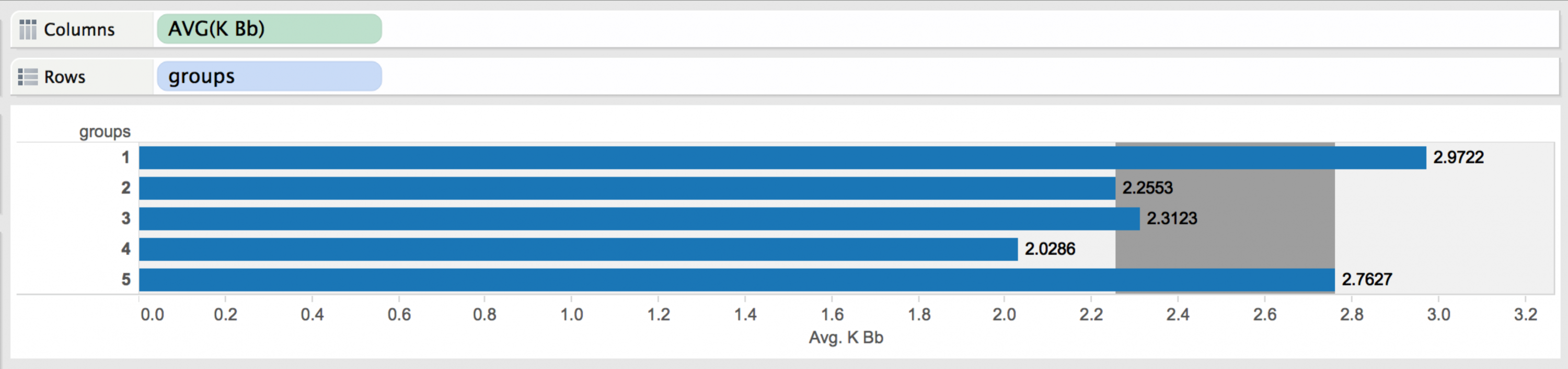
The Five Pitcher Groups
Group 1 – Closers: Excellent control with high strikeout-to-walk ratios, veteran status, and high strikeout numbers. Includes pitchers like Mariano Rivera and Jonathan Papelbon.
Group 2 – Lefty Specialists: 99.35% left-handed, 75.16% relief pitchers with nearly zero complete games in 2013. Includes pitcher Phil Coke.
Group 3 – The Other Starters: 99.9% starting pitchers with average K/BB ratios, average-to-high strikeouts per game, and average age. Mostly right-handers with higher ERAs. Includes Josh Beckett.
Group 4 – The Rest of the Pen: Right-handed relievers with high ERAs, below-average K/BB, and average strikeouts per game. These pitchers typically appear in mop-up or key seventh-inning situations.
Group 5 – Seasoned Veterans: Starters with low ERAs, above-average K/BB, high strikeouts per game, and the most league experience. Includes Cliff Lee, Felix Hernandez, and Stephen Strasburg.
The Problem with New Observations
When encountering new observations, complete data isn’t always available. One technique called short form analysis takes a subset of original cluster variables to develop a logistic regression predicting cluster membership.
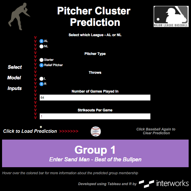
For baseball, a multinomial logistic regression model using these five statistics achieved 89% accuracy on validation data:
- League (American or National)
- Pitcher Type (Starter or Reliever)
- Handedness
- Number of Games Played In
- Strikeouts Per Game
A general rule suggests ensuring short-form models predict at least 70% accuracy on validation data, sacrificing some precision for practicality.
Tying It Together in Tableau
Once a model is built and validated, making it visually appealing and user-friendly is crucial. Tableau with R integration allows creation of interactive dashboards where users input values and receive predictions.
The Bigger Picture
Market segmentation is well-established, but the ability to perform such analysis is often new. Similar to how Moneyball transformed baseball through advanced statistics, the fusion of big data, predictive analytics, and data mining transforms business across every sector.